Usability Test Analysis
LUMA.AI
A collaborative UX evaluation and redesign strategy for LUMA.AI, focused on improving usability, discoverability, and user experience of key AI video generation features using heuristic evaluation, task-based testing, and A/B testing.
Description
My Role
This was a team project with four UX designers.
My contributions:
Conducted heuristic evaluation and bug analysis
Designed and moderated usability test sessions
Led A/B testing setup and data synthesis
Synthesized competitive and SWOT analysis into actionable insights
Co-drafted recommendations for UX improvement
To identify and solve key usability issues in LUMA.AI’s interface through heuristic analysis, usability testing, and iterative design feedback, in order to improve task success, feature discoverability, and user satisfaction.
Objective
Heuristics Evaluation
Visibility of System Status
Match Between System and Real World
User Control and Freedom
Consistency and Standards
Issue:
No clear indication of what happens after clicking "TRY NOW" Users may be unsure if they’ll encounter a sign-up form, demo, or tutorial.
Issue:
"Dream Machine" lacks clarity. The feature needs a more user-friendly explanation.
Issue:
No "back" or "cancel" option after clicking "TRY NOW."
Issue:
The "TRY NOW" button isn't standard for AI websites, where terms like "Learn More" or "Start Free Trial" are more expected.
Recommendation:
Include a progress indicator or description to manage user expectations.
Recommendation:
Use real-world analogies like “Generate AI videos from your text or images.
Recommendation:
Add a visible exit or breadcrumb navigation.
Recommendation:
Use more familiar language for CTAs to align with user expectations.
Error Prevention
Recognition Rather Than Recall
Flexibility and Efficiency of Use
Aesthetic and Minimalist Design
Issue:
The system doesn't prevent the upload of incorrect file formats.
Issue:
Users are required to recall features and steps from memory.
Issue:
There are no advanced options for experienced users to accelerate the flow.
Issue:
Certain areas feel cluttered, detracting from core functionality.
Recommendation:
Validate file formats before submission and provide guidance if errors occur.
Recommendation:
Display suggestions for missing or potential prompt improvements directly in the interface, and offer real-time prompts for adjustments.
Recommendation:
Provide shortcuts or expert modes for users familiar with the tool.
Recommendation:
Refine the layout to prioritize essential features, reducing the visual load.
Help Users Recognize, Diagnose, and Recover from Errors
Help and Documentation
Issue:
Error messages are vague and unhelpful.
Issue:
Help resources are not easily accessible, especially for complex actions.
Recommendation:
Provide more detailed error messages with suggestions on how to fix issues.
Recommendation:
Add clearer access to detailed guides or tutorials, especially for first-time users dealing with complex tasks like rendering or editing.
LUMA AI
Usability Testing
Goals
Interaction
Observe how users navigate and engage with different features to complete key tasks.
Confusion
Identify areas where users experience confusion or unclear pathways.
Difficulty
Analyze aspects of the site that are difficult to use, including navigation or design issues.
Feedback
Determine if users receive clear feedback for their actions, such as form submissions or error messages.
Methodology
Familiarity with AI tools - Participants had varying levels of experience with AI
Experience with similar tools - Participants included both users who had previously used similar AI platforms or websites and those who had not
Diverse Demographic - To account for different user behaviors and expectations , we ensured diversity in streams and backgrounds.
By adhering to this criteria, we successfully recruited 4 participants who met the requirements for this study.
Screening Criteria
Given the limited number of participants, we carefully selected individuals to ensure diverse perspectives. The screening criteria included:
Channels Used
Participants were chosen in person using convenience sampling.
Outreach & Screening
For this user testing, we outreached to the university students to find participants who fit the criteria of being design students from different disciplines such as UX Design, Animation and Immersive Media Design.
The participants were selected based on their familiarity with AI tools , as well their experience with Generative AI.
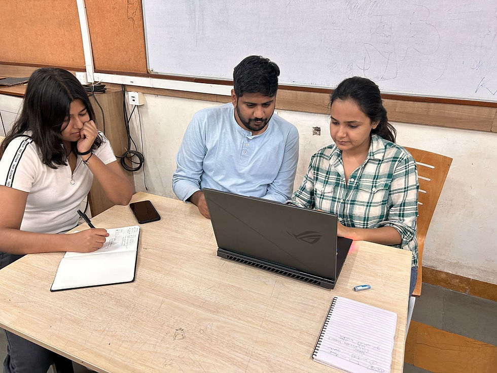
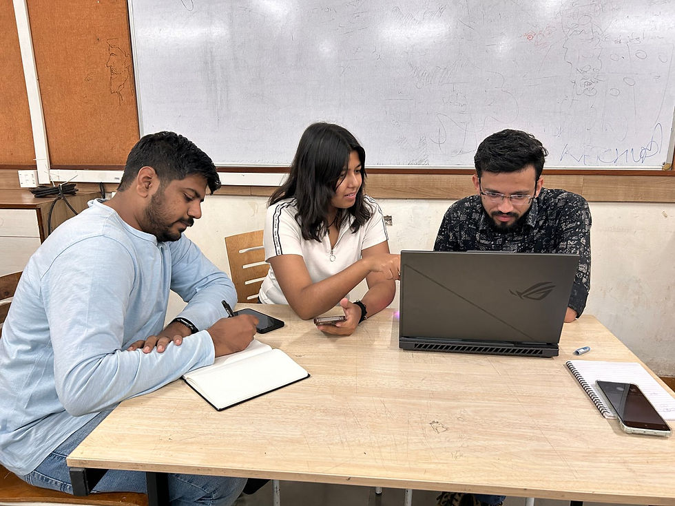
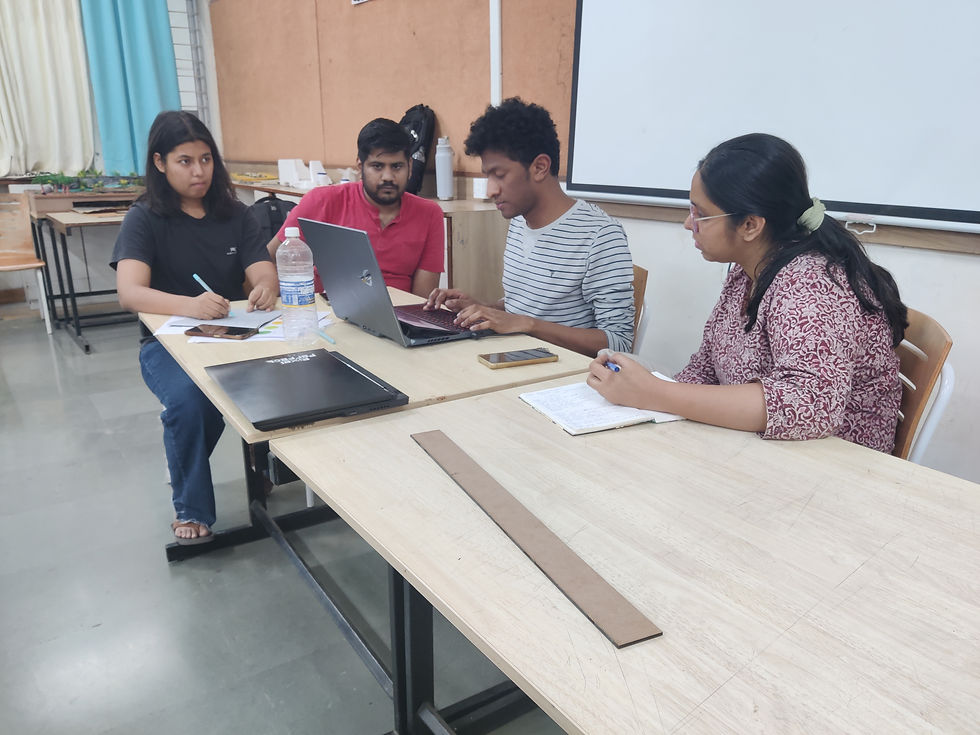
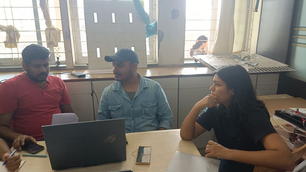
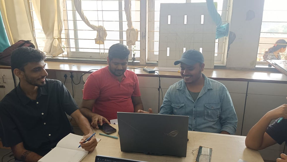
Testing Setup and Moderation
Time Management
The team measured the duration of each session as well as the tasks to track the time taken by participants to complete the given tasks.
Participant Introduction and Screening
At the beginning of each session, the team introduced themselves to the participant and explained the purpose of the study.
System Preference
Participants were provided with one of our system for the testing as the software was paid.
Interchangeable Roles
With each interview, we swapped our roles as moderator, facilitator and note-takers.
Consent and Availibility
For the participants, the team informed them about the user testing process and requested their consent to participate.
Team Composition
The testing team consisted of four members - one person acted as the
moderator, one as a facilitator, while the other two served as the note-takers.

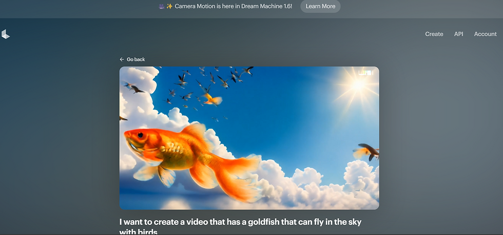
Explore the website and find the pricing page.
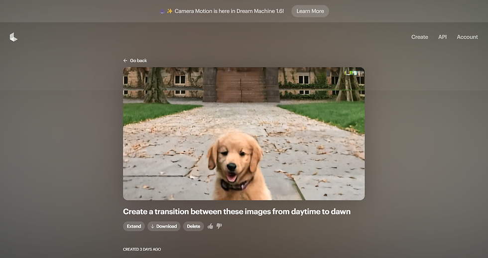
Using image-to-video generation using the keyframes and deleting the video.
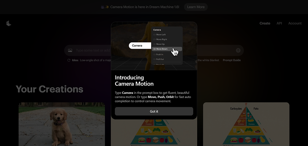
Using text-to-video generation and using the “extend” feature while also using the advanced “camera motion”.
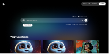
Users started on the homepage and were first asked what were the initial thoughts on the website landing page and the purpose of this website just judging by the landing page.
Users began by navigating to the image-to-video generation tool and were asked to create a video by adding keyframes (first frame and last frame). After completing the keyframe adjustments, they were instructed to delete the generated video.
Users were asked to explore the text-to-video generation tool, starting by inputting a prompt and selecting the ‘extend’ feature to lengthen the video sequence. They were then tasked with adjusting the advanced ‘camera motion’ settings to enhance the video’s dynamic feel.
Task Analysis
Couldn't find subscription from main page. Found it from footer
‘Try now’ is misleading feels like it will take to subscription directly
‘Try now’ is misleading feels like it will take to subscription directly
Confused between ‘try now’ & ‘join us’
User 4
User 3
User 2
User 1
Task 1
Task 2
Task 3
Should show something while rendering
Camera Motion not found
Couldn't use camera motion
No indication for video generation
Expected pop-up for extended video
Couldn't use camera motion
Thought ‘ ‘ is refresh
No indication for rendering and extend
Camera Motion not found
Camera Motion not found
No clear indication of time required for video generation
Uploaded both images together
Confused if generation needed prompt ot not.
Couldn't find key-framing
Couldn't find two images in one go
Approached like chat-gpt
Short prompt errors
Confused in prompts
Prompt guide not found
Usability Test Key Insights
Frustration over unclear hierarchy; suggestion to move key features to the top.
Overwhelmed from unfamiliar terminology.
The absence of back button added to the confusion and difficulty in navigation.
Need for guidance in writing effective prompts.
Usability Test Key Insights
Lack of interest towards the guide due to overwhelming text.
Need for guidance in writing effective prompts.
Usability Test Key Insights
Frustration over the absence of control for video lengths (e.g., 5s, 10s, 15s)
Frustration with the lack of precision in video output.
Uncertainty about video processing locations and times.
Usability Test Key Insights
Need for a search button to enhance navigation.
Confusion when the "Try Now" option did not lead to pricing information.
Frustration with Genie’s footer location; suggestion for more prominent placement.
The absence of back button added to the confusion and difficulty in navigation.
Media
User tests conducted by the team.
LUMA AI
A/B Testing
Task 1
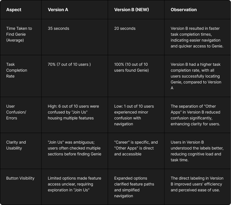
Task1 : Users were asked to locate the "Genie" feature on the Luma AI platform.
Versions Tested:
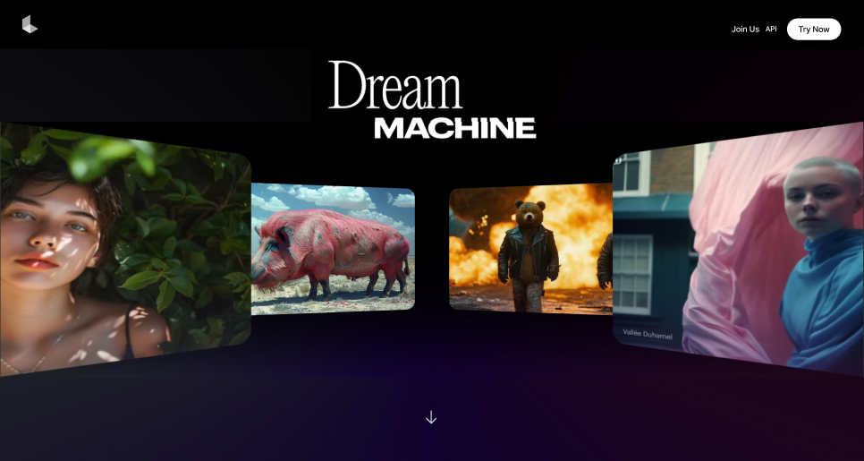
Version A: Navigation included options "Join Us," "API," and "Try Now."
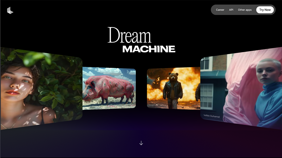
Version B: Navigation included options "Career," "API," "Other Apps," and "Try Now."
Success Criteria: The version with the shorter time to complete the task, higher completion rate, lower confusion, and better user satisfaction would be considered more effective.


Task completion rate improved from
70% to 100%
HIGHER
User satisfaction in Version B, with significantly less confusion.
15 sec
reduction in average task completion time.
Task 1
Task 2
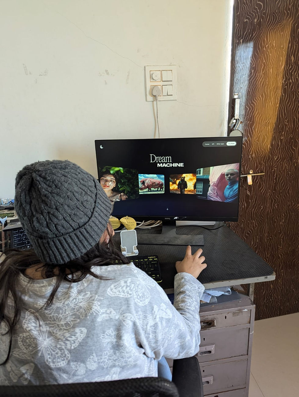
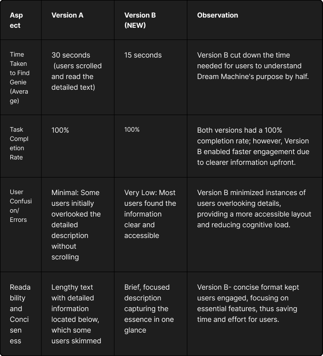
Task 2: Users were asked to understand what Dream Machine does and try it out on the Dream Machine website.
Versions Tested:
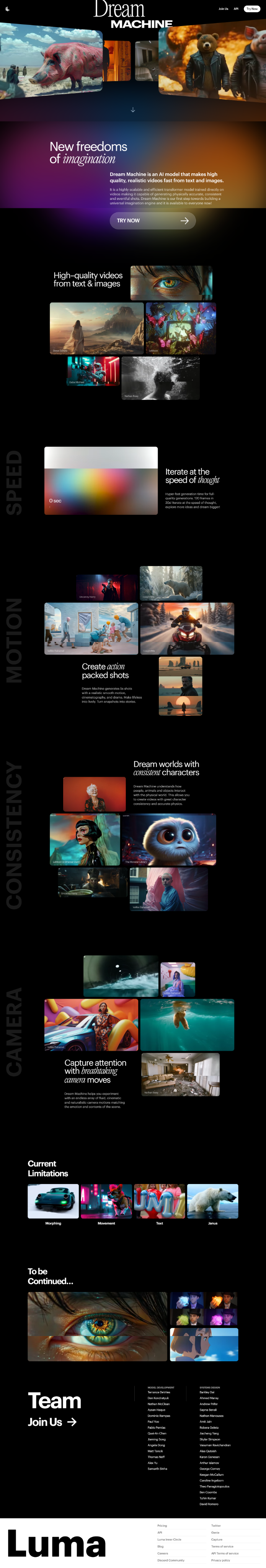
Version A1: The website included the "Dream Machine" title at the top, with a long, detailed description about its purpose located below the scroll.
Version B1: The website displayed the "Dream Machine" title along with a concise description above the fold, providing an overview at a glance.
Success Criteria: The version with a shorter time to fully understand the purpose of Dream Machine, no need for scrolling, lower confusion, and higher user satisfaction would be considered more effective.
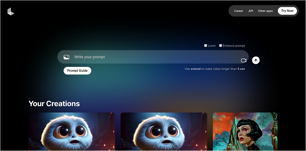
Other apps
API
Career


New freedoms of imagination
Dream Machine is an Al model that makes high
quality, realistic videos fast from text and images.
API
Other apps
API
Career
TRY NOW
New freedoms
of
imagination
Dream Machine is an AI model that makes high
quality, realistic videos fast from text and images.
It is a highly scalable and efficient transformer model trained directly on
videos making it capable of generating physically accurate, consistent
and eventful shots. Dream Machine is our first step towards building a
universal imagination engine and it is available to everyone now!
TRY NOW
Task 2
Average time to understand Dream Machine's purpose in detail was
50% in Version B
67% confusion
Confusion as users found information intuitively.
90% +ve Experience
due to concise and clear layout
2.25x in engagement
due to concise, readable format
Task 3
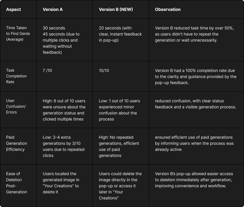
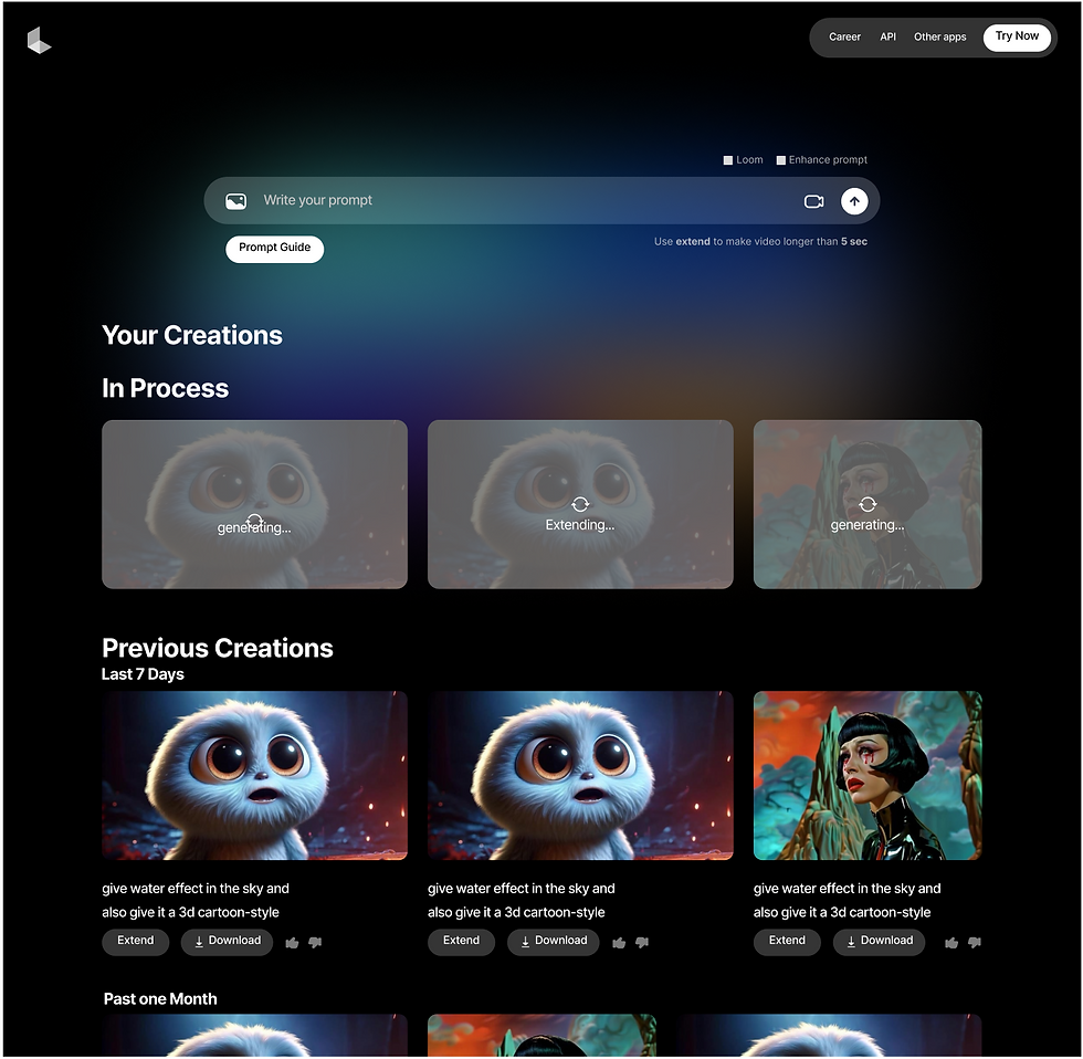
Task 3: Users were asked to generate an image based on a prompt and delete it on the Dream Machine platform.
Versions Tested:
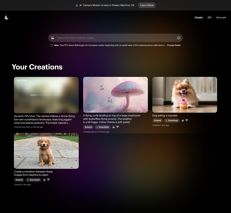
Version A: No pop-up feedback was provided when the image generation process started. The generated image appeared below the "Your Creations" section, which saved each completed generation.
Version B: A pop-up appeared with a blurred background showing "Generating…" as feedback while the image was being processed. Users could view the image generating in real-time, with options to download it immediately or close the pop-up to access it later in "Your Creations."
Success Criteria: The version with shorter task completion time, immediate feedback on the generation status, lower confusion, and higher user satisfaction was considered more effective.
Confusion and errors dropped by 83%
50%
more time efficient
Task completion rate ↑sd from 70% to 100%
Task 3

Task 4
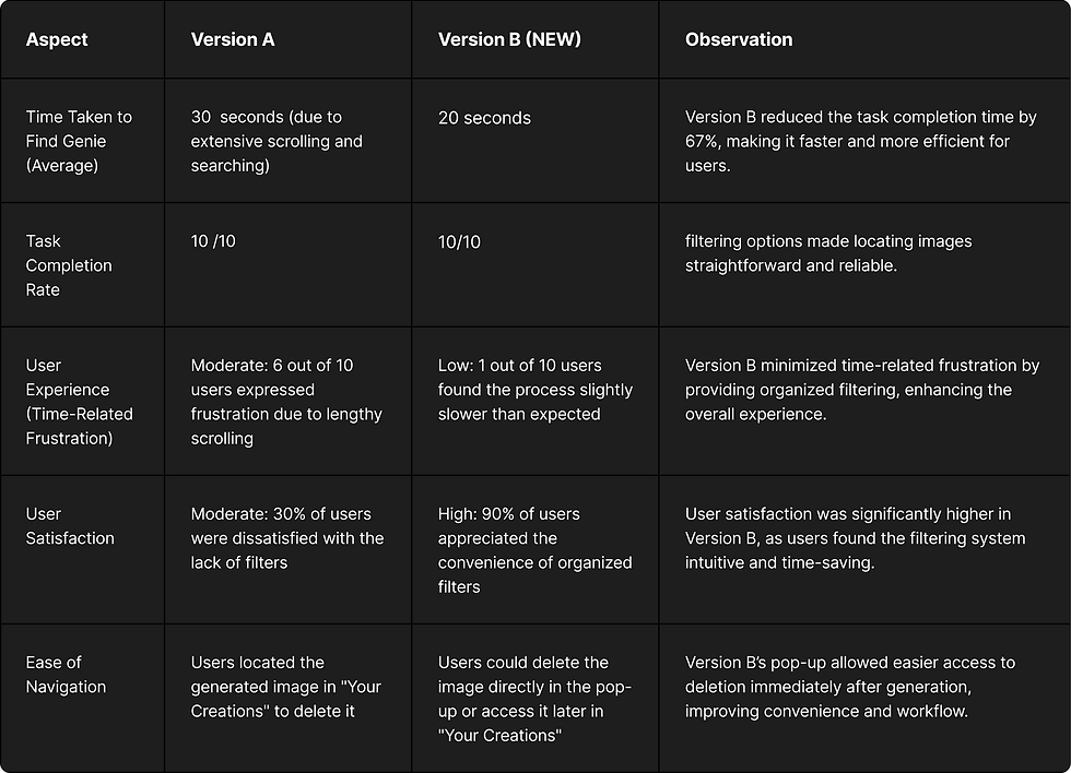
Task 4: Users were asked to locate previous creations on the Dream Machine platform.
Versions Tested:
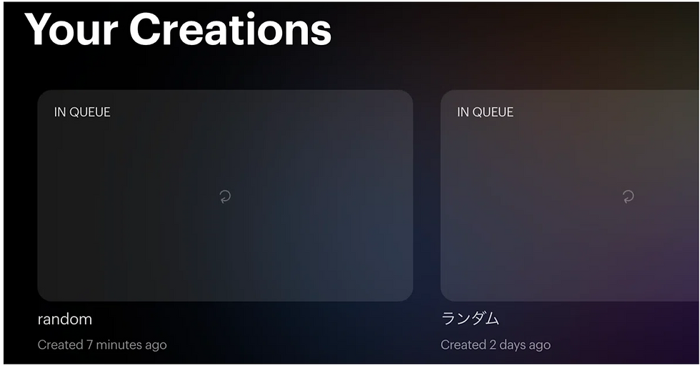
Version A: The "Your Creations" section displayed all images without any filtering options. Previous images were not categorized by date, time, or any specific attribute, making it difficult for users to locate older creations.
Version B: The "Your Creations" section included filters, with images organized by time periods (e.g., Last 7 Days, Past One Month), making it easier for users to find previous images based on recency.
Success Criteria: The version with a shorter time to locate specific previous creations, easier navigation due to filtering options, lower confusion, and higher user satisfaction was considered more effective.
User Satisfaction
increased by 80%
reduced the average time to locate previous creations by
67%
Time-related frustration
dropped by 83%
Task 4
Task 5
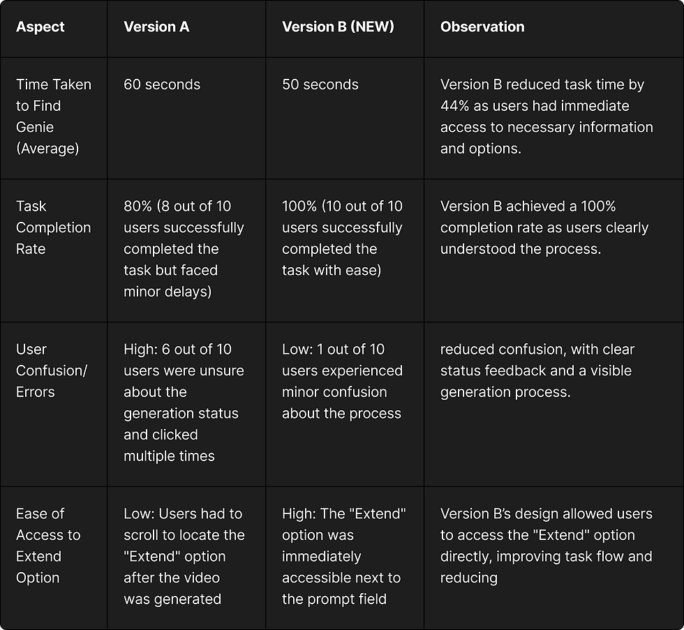
Task 5: Users were asked to give a prompt and use the "Extend" option to create a video longer than 5 seconds on the Dream Machine platform.
Versions Tested:
Version A: The "Prompt Guide" would disappear once the user started typing in the prompt field, and there was no indication near the prompt field that "Extend" is required to make videos longer than 5 seconds. The "Extend" option was only available below the generated video.
Version B: The "Prompt Guide" remained visible even after the user began typing, and a clear message near the prompt field indicated that "Extend" should be used to create videos longer than 5 seconds. The "Extend" option was also positioned close to the prompt text field.
Success Criteria: The version with a shorter task completion time, consistent visibility of the prompt guide, immediate access to the "Extend" option, and higher user satisfaction was considered more effective.
User Satisfaction
increased by 80%
Reduced task time by
44%
Task 5
A/B Testing in field